Centible
UX Researcher, UX Designer
10 months
UX research, wireframing, prototyping, UI design, collaborating with PM and developers
UX Researcher, UX Designer
10 months
UX research, wireframing, prototyping, UI design, collaborating with PM and developers

Designers
Developers
Product Manager
When conceptualizing Centible, our team aimed to create a solution to address a community need. We began by focusing on aspects of our daily lives where we believed we could offer assistance. For many students, college is their first time having full control over their own finances. Unfortunately, this frequently results in unwise spending, excessive expenditures, and often, no savings. We wondered why this was such a problem for so many students and whether there was an opportunity to emphasize the importance of fiscal responsibility.
College students experience difficulty with maintaining their current budgeting systems due to complex and distracting features.
Create a simplified transaction tracker that builds financial awareness by helping users understand their spending habits.
We learned from conducting listening sessions that each participant has a unique way of managing their finances. Ultimately two general groups emerged: users who strictly budget their money into categories, and users who simply want to ensure they don’t exceed a spending limit. Questions asked during our session included:
The top four apps our participants reported using were Mint, Truebill, Fudget, and Goodbudget. Two of these apps automatically sort transactions, which users appreciated, however they also included more complex features that distracted users. The other two applications required the user to manually type in each transaction, which users didn't think was feasible for them to maintain.
We understood four main pain points from our listening sessions and competitor analysis: there are many distractions in popular budgeting apps, it’s time-consuming to correct misclassified transactions (but inconvenient to sort them manually), and there needs to be a balance between intensive budgeting and casual tracking.

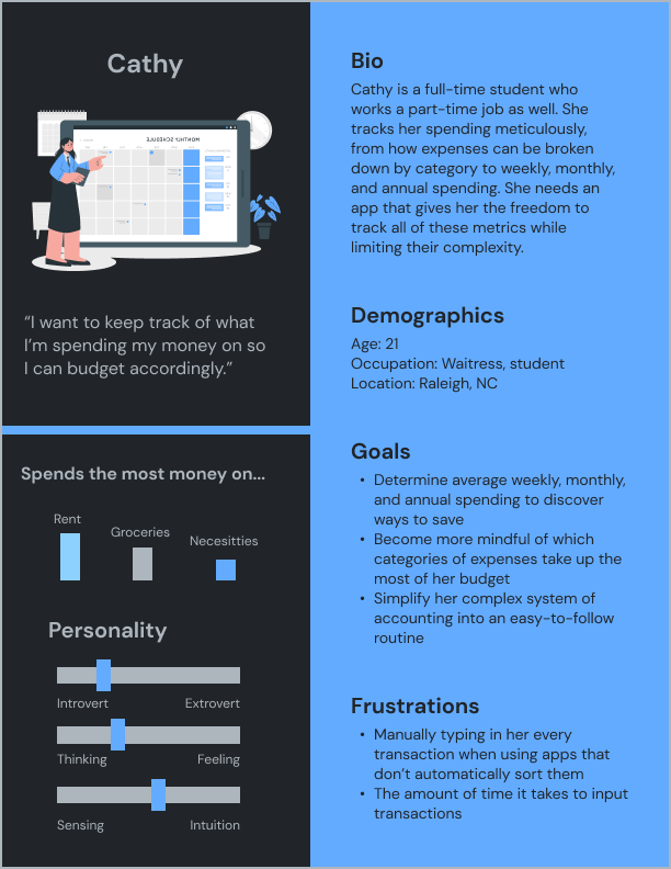
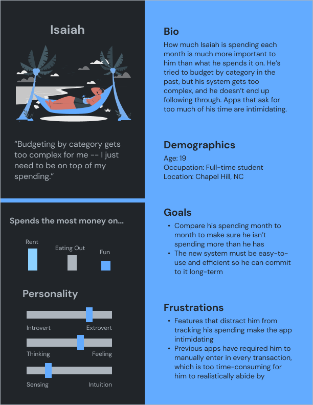
Compiling our research into personas helped us simplify our goals into actionable insights. Taking into account our two primary users, intense budgeters and casual trackers, we were now ready to start the design.
User journey, information architecture, sketches, wireframes, high-fidelity prototype V1.
From the “unboxing” experience of finding Centible in the App Store to sorting each transaction, we determined that the simplicity of our app would need to be communicated at every step of the way.
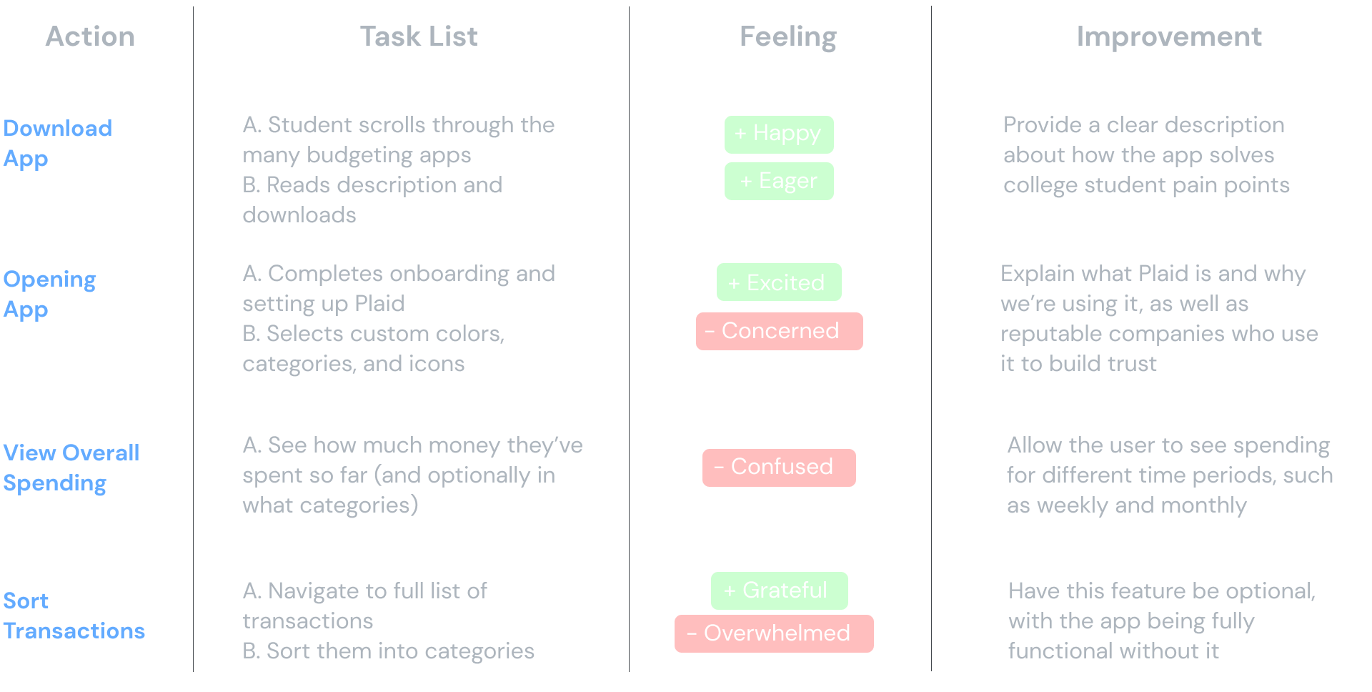
We were determined to keep our navigation simplistic and features minimal based on user sentiment that overcomplicating the experience results in users bouncing.

Initial sketches included a drag-and-drop to sort transactions, debates over a line versus bar graph for the home screen, and a list of all transactions that appeared as categorized or uncategorized.
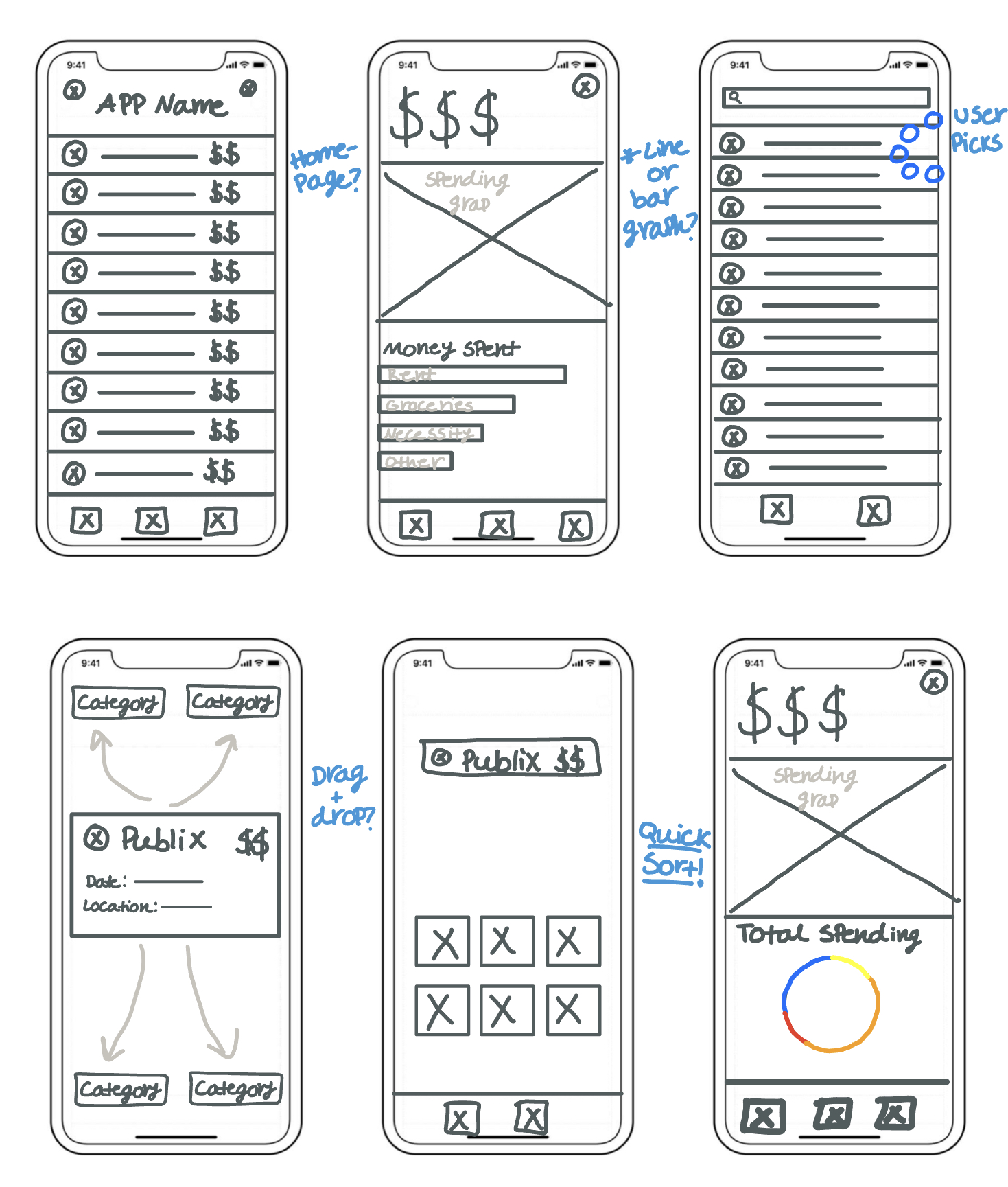
Pulling the best ideas from our wireframes, we devised a dashboard that gave users an overview of their spending and a way to sort transactions from their transactions list.
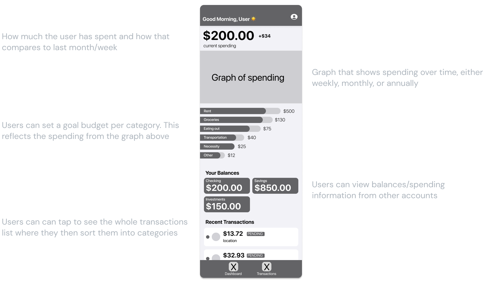
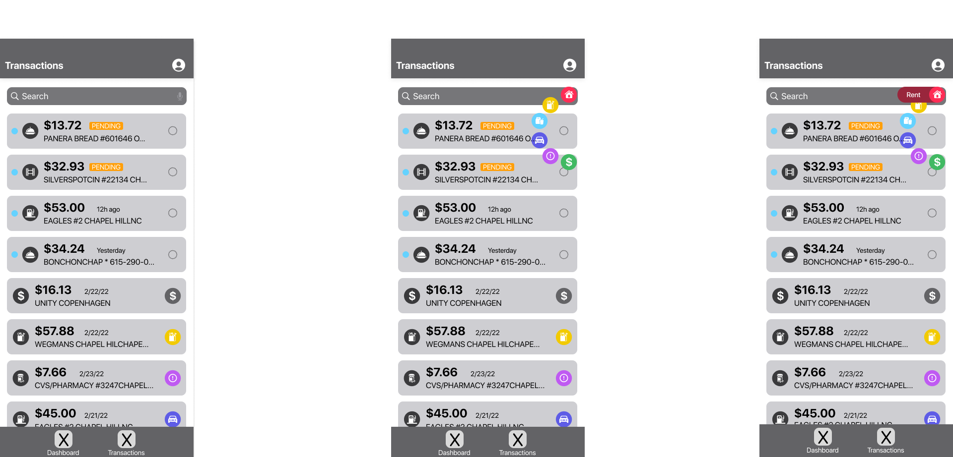
Our first high-fidelity prototype included a detailed onboarding per Apple's Human Interface Guidelines and built upon the ideas present in our wireframe.
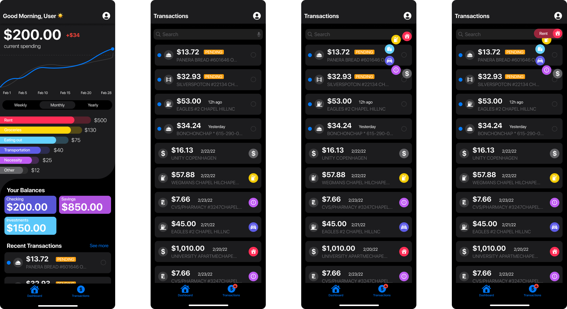
Usability testing, iterations, high-fidelity prototype V2, accessibility, style guide.
After conducting a usability study with 5 users, we received 3 actionable insights to improve our designs.
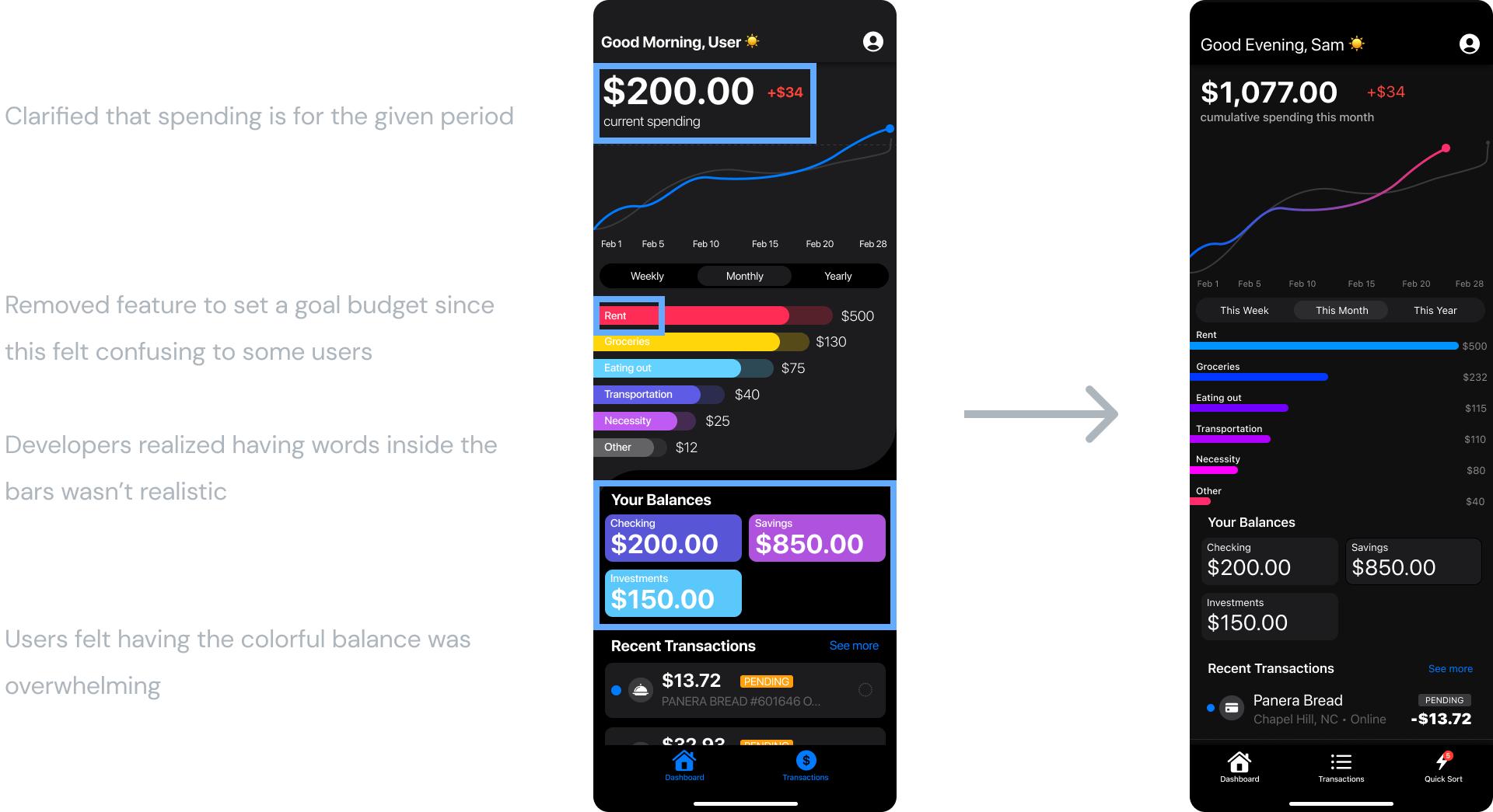
Users were confused about a number of components on the dashboard and had visual design feedback.
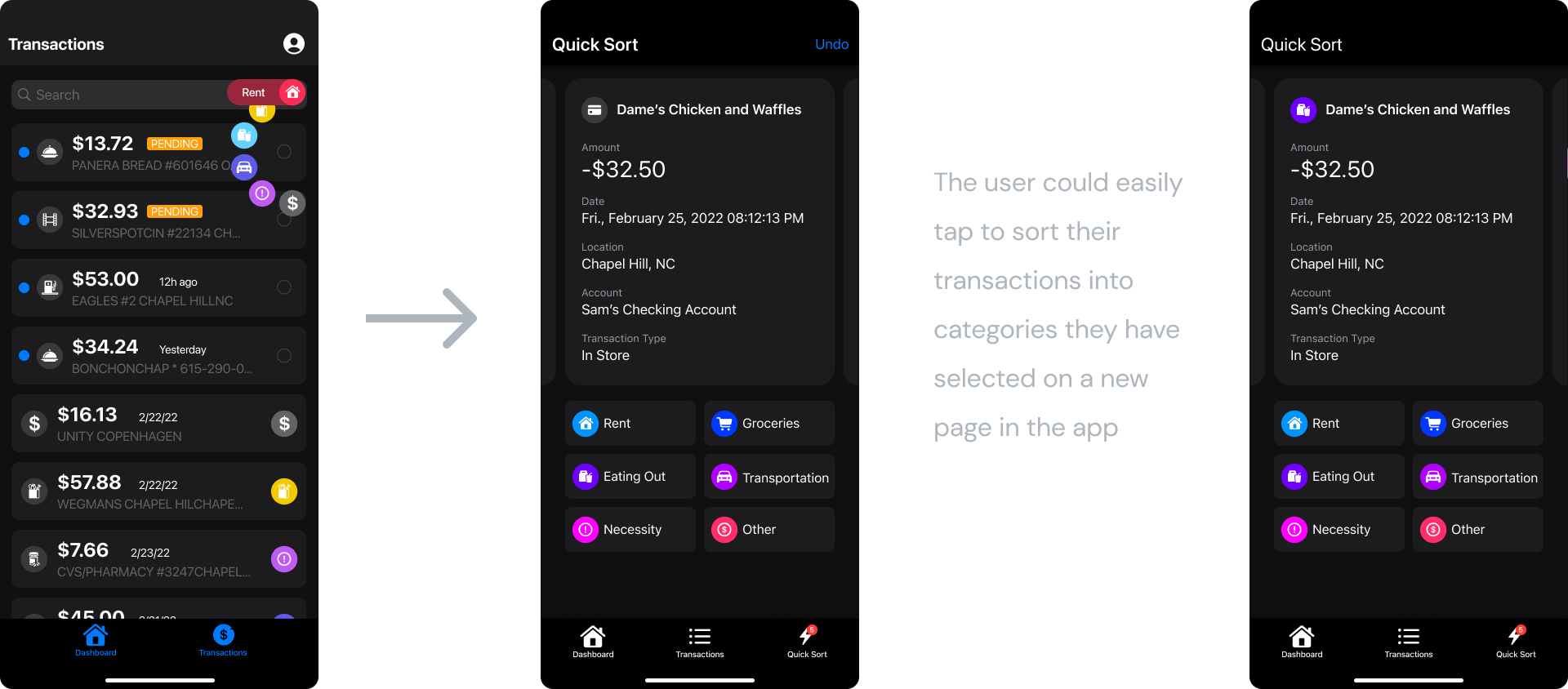
Sorting individual transactions from the transaction list was still too complicated.
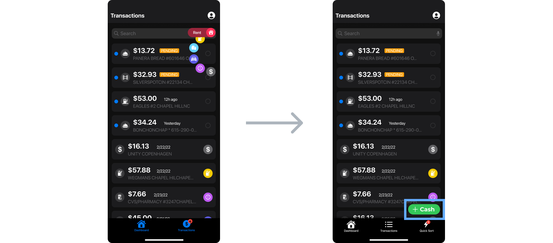
Users wanted to track the amount of cash they were spending as well as credit and debit transactions.
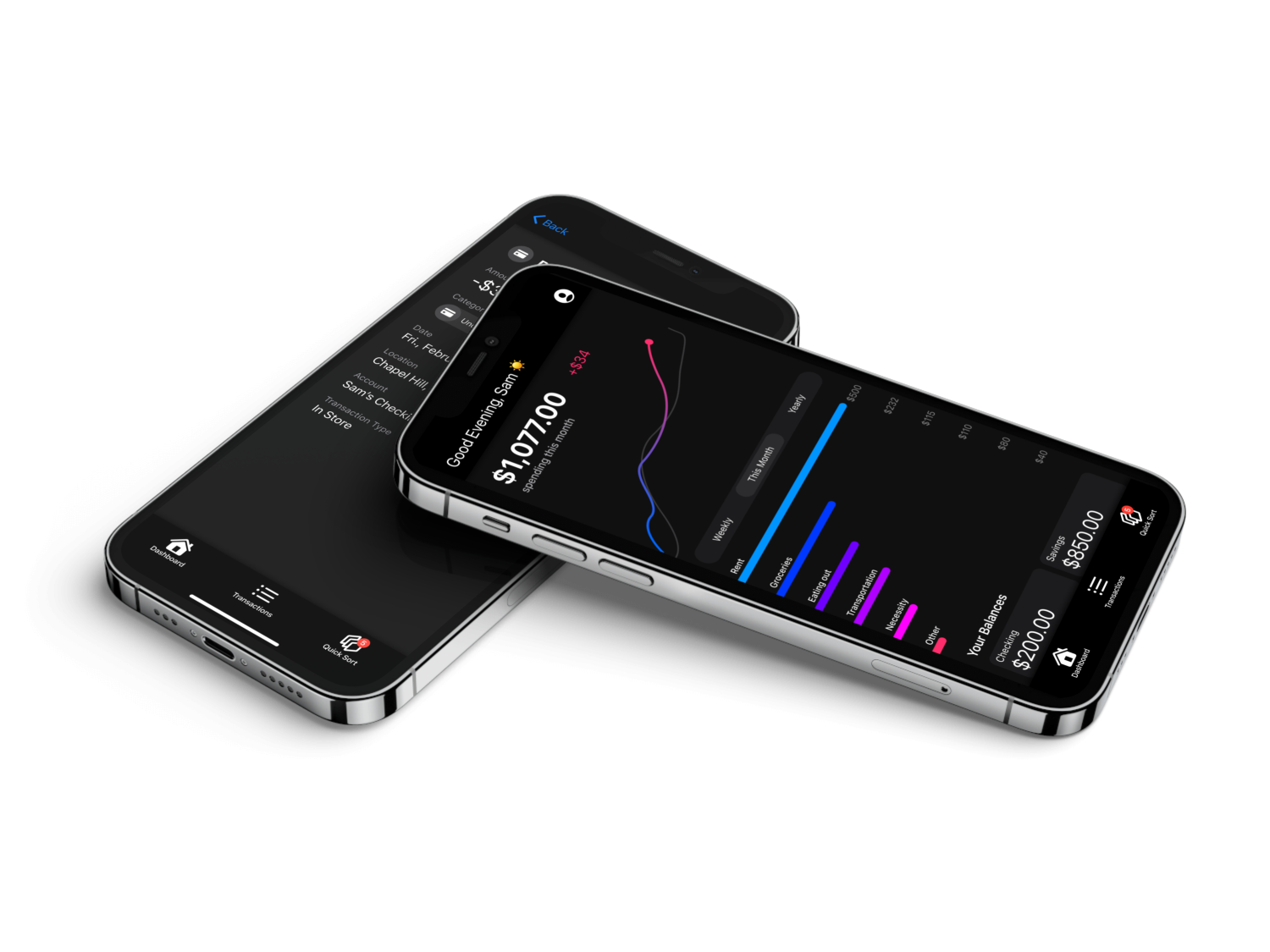
We made the dashboard more intuitive and less overwhelming by using color more intentionally and providing insight into spending periods.
In response to feedback about the inefficiency of the current transaction sorting system, we introduced Quick Sort. This feature prompts users to categorize transactions from the information provided, such as transaction name and amount, which aligns with our primary objective of enhancing spending habit awareness.

Lastly, we realized that we need to account for users who want to track cash they are spending as well.
Our high-fidelity prototype synthesized our user feedback into a usable prototype we could show to our developers.
As of December 2023, Centible is officially on the App Store! We are continuously responding to user feedback to improve the experience, from fixing bugs to adding in new features.
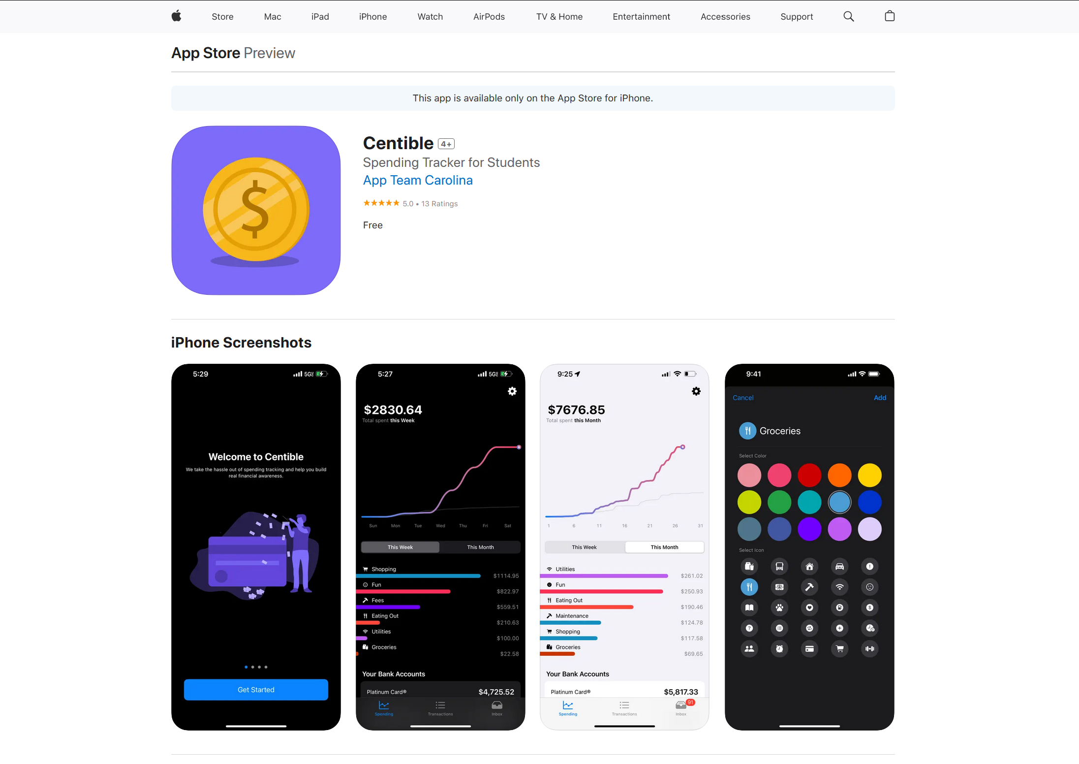
We followed best practices to ensure that our app was accessible for all users, some of which were:
Option for light mode or dark mode and users select their own custom colors.
Configured text to Apple’s Human Interface guidelines with proper tags for text.
Icons have accompanying text below them to be screen reader compatible.
Back buttons, tab bars, and search bars all located in expected locations.
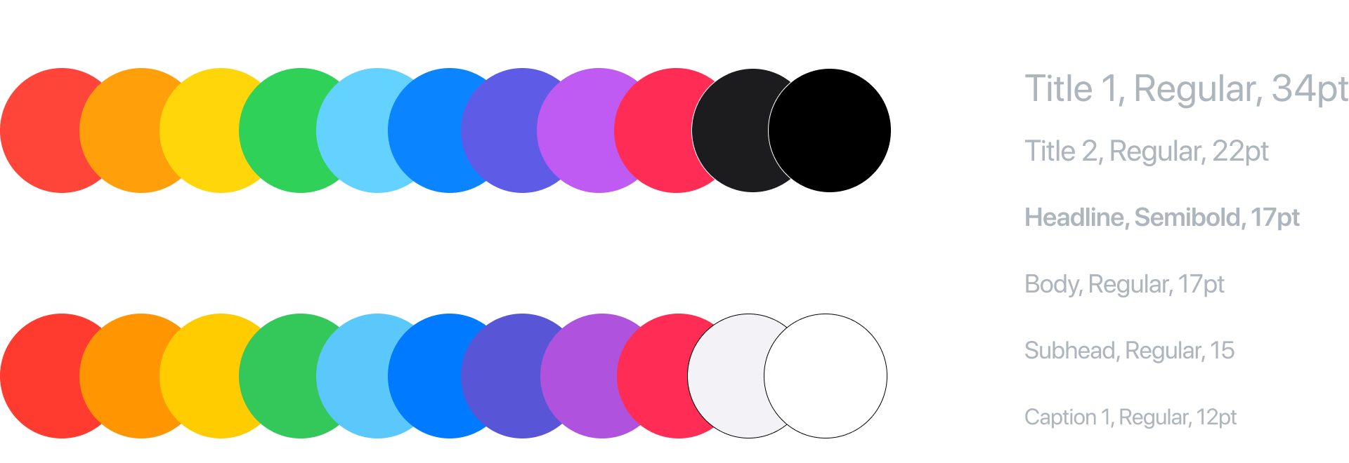
As an iOS organization, we utilize Apple's Human Interface Guidelines for our design system and components.
